<Tiles />
Added in
eventcatalog@2.7.12Renders Tiles in EventCatalog, can be great for internal and external links.
Support
The <Tiles/> component is supported in domains, services, and all messages, changelogs, and custom documentation pages.
Usage
Add Tiles and Tile component into your markdown of your page.
Tile icons are from hero icons, you can find a list of them here.
Example
---
# service frontmatter
---

## Overview

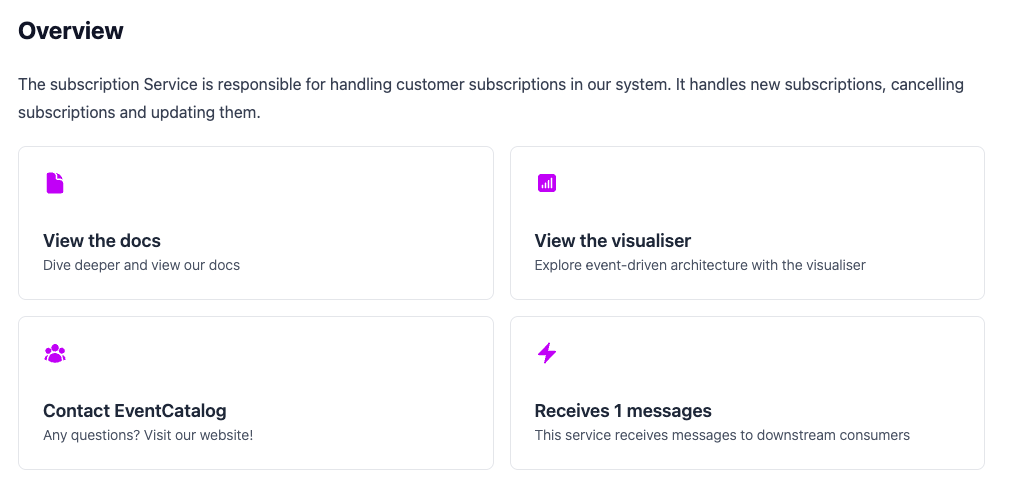
The subscription Service is responsible for handling customer subscriptions in our system. It handles new subscriptions, cancelling subscriptions and updating them.

<Tiles columns={2} >
    <!-- Basic example -->
    <Tile icon="DocumentIcon" href="/docs"  title="View the docs" description="Dive deeper and view our docs" />
    <Tile icon="DocumentIcon" href="/visualiser"  title="View the docs" description="Dive deeper and view our docs" />

    <!-- External links and open in new tab -->
    <Tile icon="UserGroupIcon" href="https://eventcatalog.dev" openWindow="true" title="Contact EventCatalog" description="Any questions? Visit our website!" />

    <!-- Dynamic Link with frontmatter in file -->
    <Tile icon="BoltIcon"  href={`/visualiser/services/${frontmatter.id}/${frontmatter.version}`} title={`Receives ${frontmatter.receives.length} messages`} description="This service receives messages to downstream consumers" />

</Tiles>
Rendered example in EventCatalog

See example in the demo EventCatalog application.
Props (<Tiles>)
| Name | Type | Default | Description |
|---|---|---|---|
title (optional) | string | (empty) | Title that gets renders above the tiles |
columns (optional) | number | 2 | Number of columns to render the tiles in |
Props (<Tile>)
| Name | Type | Default | Description |
|---|---|---|---|
title (optional) | string | (empty) | Title for the tile |
description (optional) | string | (empty) | Description for the tile |
icon (optional) | string | (empty) | Icon to show in the tile. Iconss are HeroIcons. Find a list here. |
iconColor (optional) | string | text-purple-500 | The color of the icon, using tailwind classes. |
href (optional) | string | (empty) | URL for the tile |
openWindow (optional) | boolean | (empty) | Open the URL in a new window |