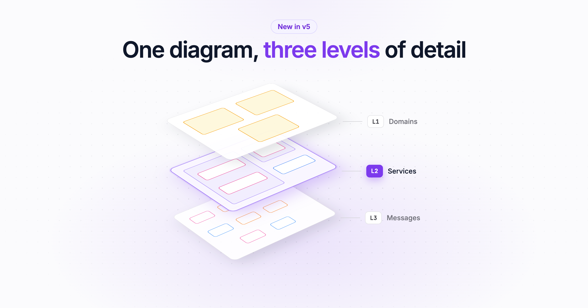
In EventCatalog v5 every domain and system has a single diagram with three levels. Start with the domains and systems that talk to each other, then zoom into services, data stores, messages and channels.
Different people ask different questions of the same architecture.
A head of engineering wants to know which domains depend on each other. An architect wants to see the systems inside a domain and how they connect. An engineer about to change a service wants to see every message it sends and receives.
Until now, EventCatalog answered those questions with different pages. A domain had a System Diagram and a Resource Diagram. A system had a Context Diagram and a Resource Diagram. Services had a Data Dependency Graph, and there was a Domain Integration Map that most people never found. They were useful, but you had to know which one to open.
In EventCatalog v5, every domain and system has one diagram with three levels of detail. Start with the big picture, then zoom in until you can see the messages.
Three levels, the same on every diagram
Every diagram in the visualiser now has a canvas toolbar with three levels: L1, L2 and L3.
| Level | What you see |
|---|---|
| L1 | Domains, systems and the relationships between them |
| L2 | The services and data stores inside them, and how they connect |
| L3 | Everything in L2, plus the messages and channels |
Here's how it works on the Payments domain. Click a level, or let it play:
The levels mean the same thing on every diagram, so once you have learned them on one page, you know how to read the rest. When a level doesn't apply to a diagram, it's greyed out. On a service diagram, for example, L1 is greyed out because there are no domains or systems to show above it.
If you know the C4 model, this will feel familiar. You start with the context, then zoom into the containers, and the diagram keeps its shape as you go.
Domains: see who your domain talks to
Open a domain and select Diagram in the sidebar.
Level 1 shows the domain with its systems and subdomains, and the other domains they send messages to or receive messages from. This is the view to share when someone asks "what does Payments depend on?"
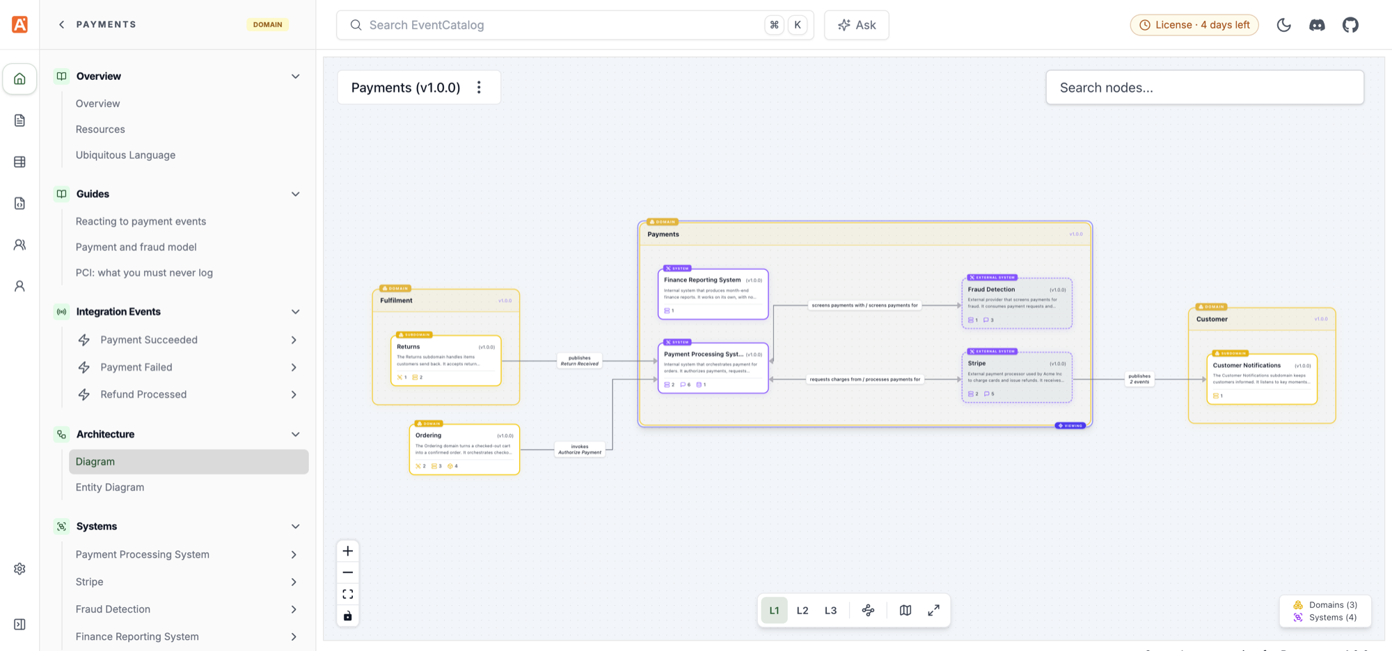
The Payments domain at L1. The diagram shows the systems inside Payments, and the Ordering, Fulfilment and Customer domains it exchanges messages with. Read the domain diagram docs.
Switch to level 2 and the systems open up into their services and data stores. Level 3 adds the messages and channels.
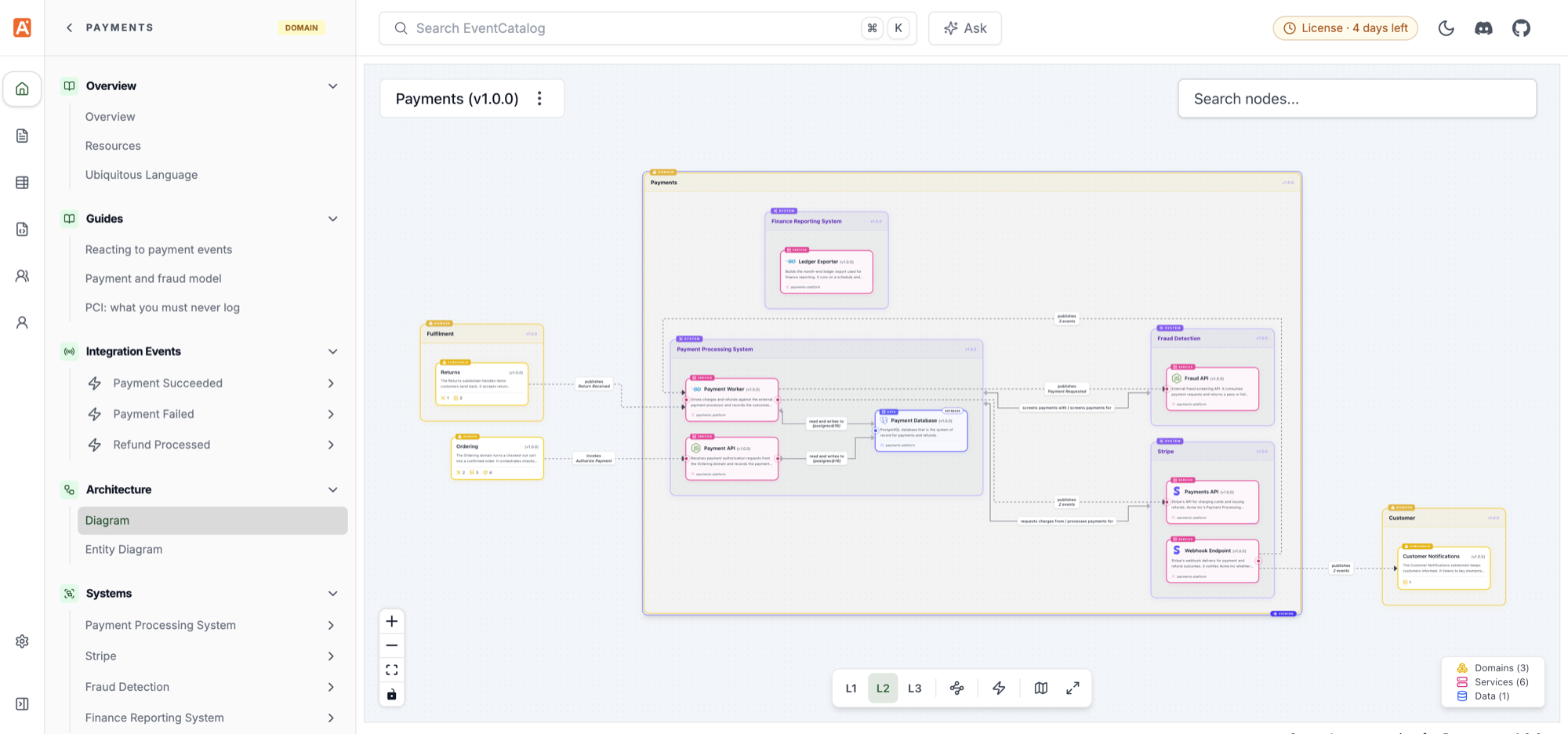
The same domain at L2. Each system is expanded into its services and data stores, and the other domains are still in view.
Subdomains are drawn as domains inside the domain, with their own systems and services. If another domain has subdomains, they are drawn inside a box for their parent domain, so you can see exactly which part of the business you are talking to.
Highlight cross-domain communication
Domain diagrams have one more button in the toolbar: Highlight cross-domain communication.
It picks out every edge that crosses the boundary of your domain, on whatever level you are viewing. In practice, this is how you find the messages other teams depend on, and the places your domain leaks into someone else's. Those are usually the conversations worth having before a change ships.
Systems: from context to the services inside
Open a system and select Diagram.
Level 1 is the system in context: the systems it has relationships with, and the people who use it. The system you are viewing is marked Viewing.
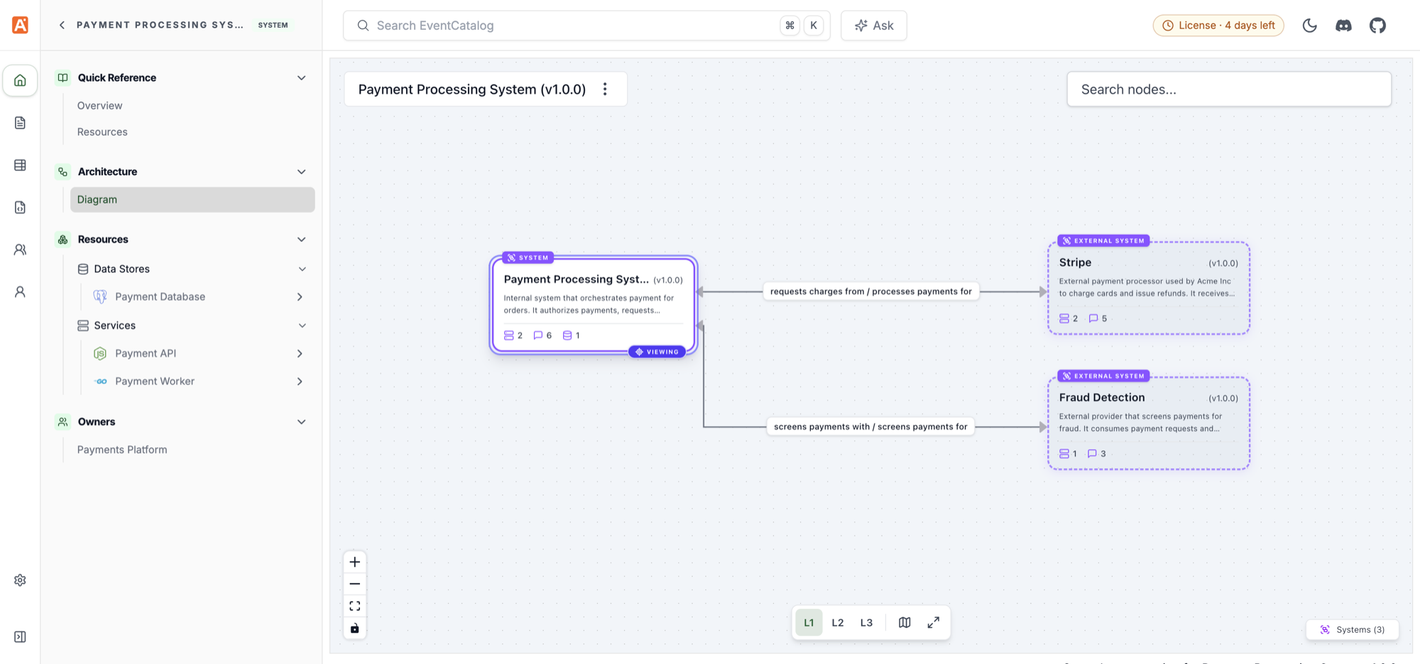
The Payment Processing System at L1, with the external systems it relies on.
Level 2 keeps that context and expands the system into its services and data stores. The relationships and actors stay connected to the expanded system, so you never lose track of how the inside connects to the outside.

The same system at L2. The services and the Payment Database are inside the system, and Stripe and Fraud Detection are still connected. Read the system diagram docs.
Share a link at the right level
The level is kept in the URL, so the link you share opens at the level you were looking at:
/visualiser/domains/payments/1.0.0?level=1
/visualiser/systems/payment-processing-system/1.0.0?level=2
This is a small thing, but it changes how diagrams get used. You can link L1 in a planning document for leadership, and L3 in a pull request for the team reviewing it. Same diagram, same source of truth.
If you embed <NodeGraph /> on a domain page, it now shows the domain's diagram at level 1, so your domain docs open with the big picture.
Diagrams that are easier to read
We also rebuilt how diagrams are laid out. EventCatalog now uses ELK instead of dagre:
- Edges run at right angles around nodes, and each edge has its own connection point, so they no longer pile on top of each other.
- Edge labels sit on their edge, so it's clear which label belongs to which line.
- Nested groups are laid out together, so systems inside a domain, and services inside a system, stay in their boxes.
- Switching levels animates, and nodes leaving the graph fade out, so you can follow where things went.
A few other improvements came with it:
- Click a legend entry to hide those nodes. Hide all the data stores, for example, and the diagram lays itself out again without them. Hidden messages and channels keep the nodes either side connected.
- Hide messages from the canvas menu when you only care about who talks to whom.
- Your level is remembered for each kind of diagram, so if you always read services at L3, they open at L3.
What changed from v4
Because everything now lives on one Diagram page, a few pages and labels have changed:
- The domain System Diagram and Resource Diagram, and the system Context Diagram and Resource Diagram, are now the single Diagram page. Old links redirect to the matching level.
- The service Data Dependency Graph is gone. Level 2 of the service diagram shows the same data stores, and old links redirect there.
- The Domain Integration Map is gone. Level 1 of each domain diagram shows how it integrates with other domains.
- In the sidebar, "Map" is now "Diagram", "Entity Map" is now "Entity Diagram", and "System Context Map" is now "System Context Diagram".
Layouts you saved in dev mode for the old Resource Diagrams don't carry over, because the new diagrams are laid out differently. Open the diagram and save the layout again if you need it. The v5 upgrade guide has the full list.
Try it
Diagram levels are part of EventCatalog v5. Upgrade your catalog:
npm install @eventcatalog/core@latest
Open any domain or system, select Diagram, and switch between L1, L2 and L3. Then try Highlight cross-domain communication on one of your domains. I'd love to know what you find.
Read the domain diagram and system diagram docs, share feedback in Discord, or open an issue on GitHub.