# Create your first component
Copy as Markdown[View as Markdown](/docs/development/components/custom-components/create-your-first-component.md)
***
In this guide, we will create a simple component and add it to a service page.
## Create the component[](#create-the-component "Direct link to Create the component")
Create a new file in your catalog.
File
```
/components/service-note.astro
```
Add the component markup.
/components/service-note.astro
```
---
const { title = 'Service note' } = Astro.props;
---
```
The `not-prose` class keeps the documentation page typography from changing the spacing and styles inside your component.
## Add it to a page[](#add-it-to-a-page "Direct link to Add it to a page")
Open one of your service pages and import the component.
/services/OrderService/index.mdx
```
---
id: OrderService
name: Order Service
version: 0.0.1
summary: Handles customer orders.
---
import ServiceNote from '@catalog/components/service-note.astro';
# Order Service
```
## Check the page[](#check-the-page "Direct link to Check the page")
Start your catalog and open the service page.
```
npm run dev
```
You should see the custom note rendered inside the service documentation.
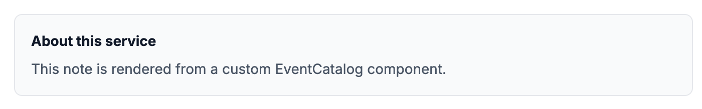A custom component rendered inside an EventCatalog service page.
tip
Start small. Once you can render one component, the same pattern works for richer cards, tables, status panels, and diagrams.