Component List
<Schema />
This component will render your schema to the document. To make this work you will need to add a schema file into your event directory.
For more information check out the schema guide for events.
<SchemaViewer />
This component will render your schema as documentation viewer to the document. To make this work you will need to add a schema file into your event directory.
For more information check out the schema guide for events.
Props
| Name | Type | Default | Description |
|---|---|---|---|
title | string | (empty) | Title to render above your schema viewer |
maxHeight | number | (empty) | The max height of the schema viewer |
defaultExpandedDepth | number | 1 | Define the expand level for displaying nested objects/properties |
renderRootTreeLines | boolean | false | Define show/hide a visual line for the root level |
Usage
<SchemaViewer />
<SchemaViewer title="Event properties" defaultExpandedDepth='5' renderRootTreeLines maxHeight="500" />
<Mermaid />
This component will render mermaid diagrams into your documents.
If you use <Mermaid /> without any props EventCatalog will render the relationships between your consumers and producers.
If you would like to render custom mermaid diagrams you can use the charts prop on the diagram.
Read Mermaid documentation if you want to learn what other graphs you can render.
Props
| Name | Type | Default | Description |
|---|---|---|---|
title | string | (empty) | Title to render above your chart |
charts | string[] | [] | An array of mermaid charts to render to your document |
Usage
<Mermaid />
<Mermaid title="Event Rules & Targets" charts={[`flowchart LR
Start --> Stop`]} />
Remember the relationship between events and services is stored within the event itself through the producer and consumer frontmatter properties.
For more information check out the mermaid guide for events and mermaid guide for services.
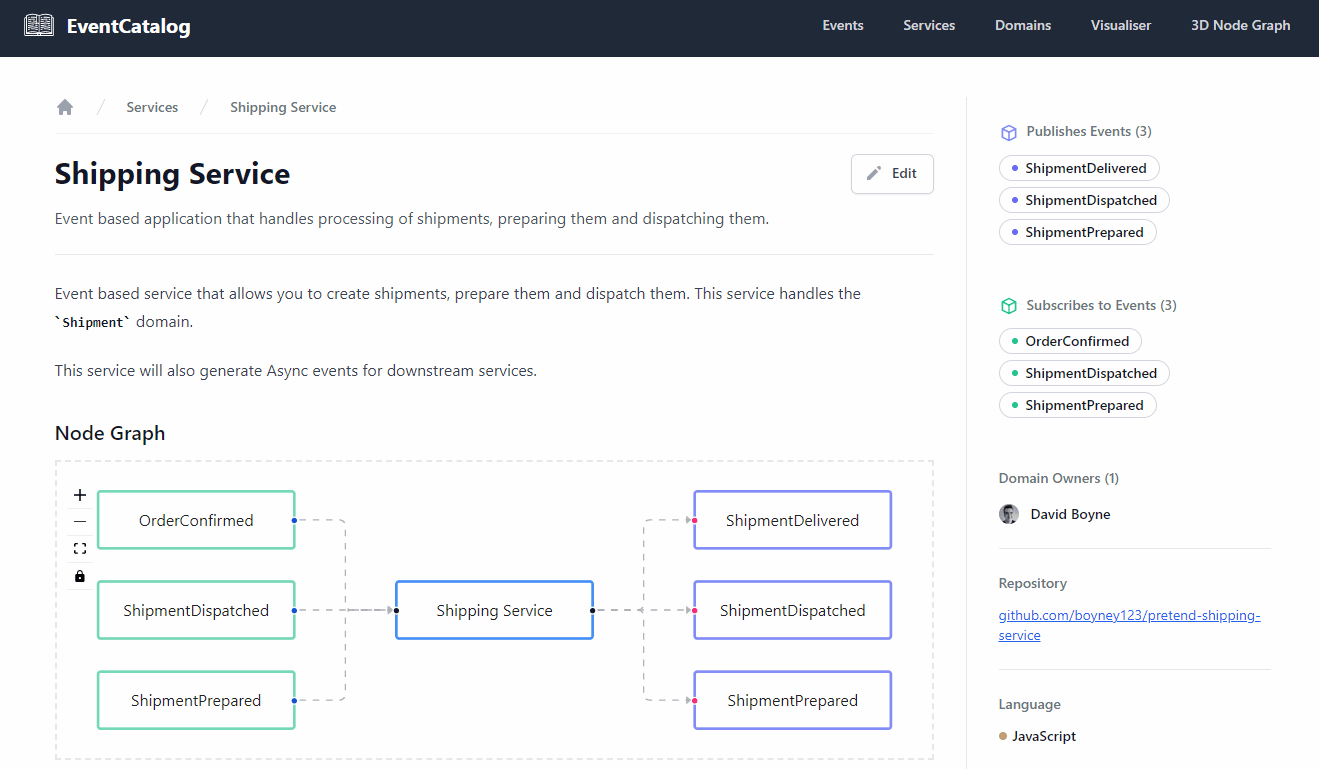
<NodeGraph />
This component will render ReactFlow diagrams into your documents. Clicking a node will navigate to the event or service page.
EventCatalog will render the relationships between your consumers and producers.
Props
| Name | Type | Default | Description |
|---|---|---|---|
title | string | (empty) | Title to render above your node graph |
maxHeight | number | (empty) | Set the max height of the node graph |
maxZoom | number | 10 | Set the max zoom level of the node graph |
fitView | boolean | true | Fit all elements on the view size |
isAnimated | boolean | true | Toggle if the node connections should be animating |
isDraggable | boolean | false | Toggle if the nodes are draggable |
Usage
<NodeGraph />
<NodeGraph maxHeight={400} isDraggable={true} isAnimated={true} fitView={false} />
<Admonition />
Rendered Examples
Rendered Example
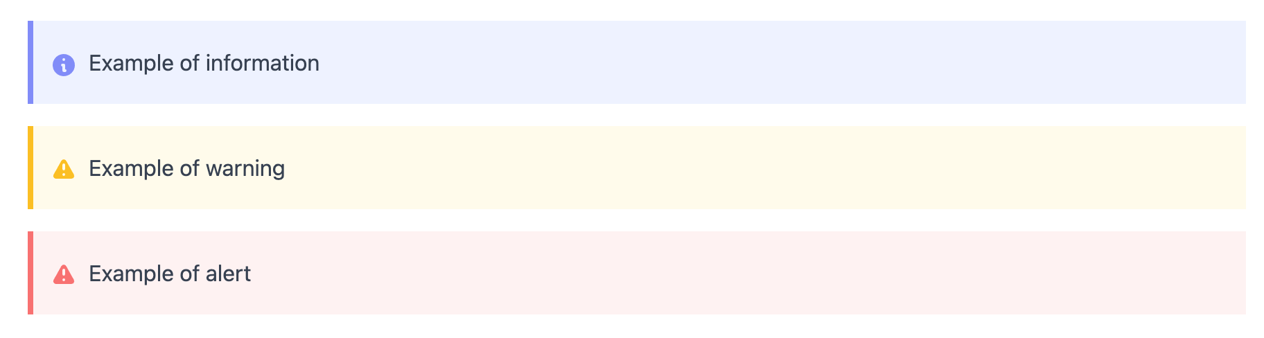
Usage
<Admonition type="info">Example of information</Admonition>
<Admonition type="warning">Example of warning</Admonition>
<Admonition type="alert">Example of alert</Admonition>
<EventExamples />
This component will allow you share code examples for any event. Reasons why you might do this:
- Help the onboarding of the event with code
- Show developers how to trigger the event
- Show developers how to consume the events
Any language is supported!
Rendered Example
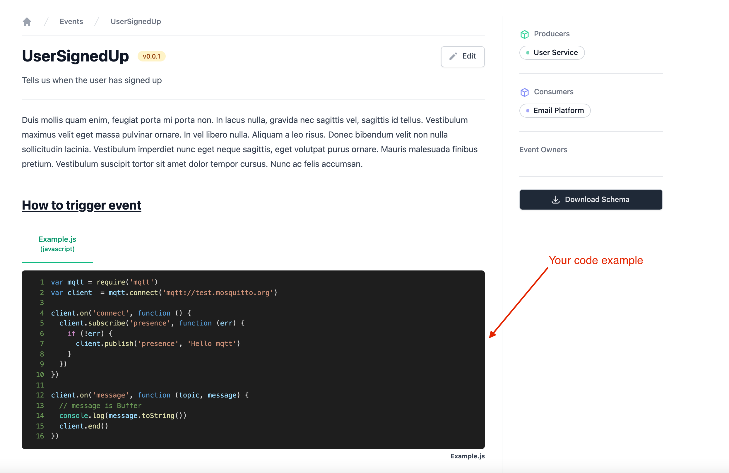
Usage
<EventExamples title="How to trigger event" />
EventCatalog will look inside your examples directory and every example will be rendered in it's own tab.
If you want to learn more you can read the code examples guide.
<OpenAPI />
This component will render any openapi.yaml or openapi.json file inside your service folder.
EventCatalog uses Swagger UI to render your OpenAPI document within EventCatalog.
To understand how it works and use OpenAPI with your Services checkout the schema guide for openapi.
Props
| Name | Type | Default | Description |
|---|---|---|---|
showTitle | boolean | true | Show or hide the title rendered by Swagger UI |
url | string | (empty) | Optional URL to load your OpenAPI file. If you provide a URL to load, this will be used over the local file system, and the file will be loaded from an external URL. |
Rendered Example
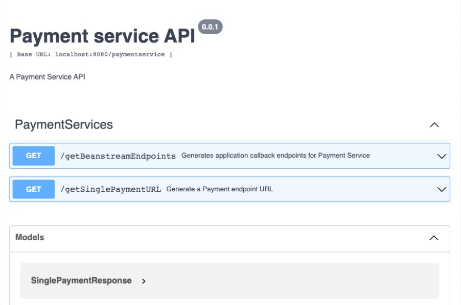
Usage
<OpenAPI />
Make sure you have your openapi.yaml or openapi.json file inside your service.
e.g /services/Payment Service/openapi.yaml
The <OpenAPI /> will only work with a valid openapi file inside your service directory.
<AsyncAPI />
This component will render any asyncapi.yaml file inside your service folder.
EventCatalog uses asyncapi-react to render your AsyncAPI document within EventCatalog.
To understand how it works and use AsyncAPI with your Services checkout the schema guide for asyncapi.
Props
| Name | Type | Default | Description |
|---|---|---|---|
url | string | (empty) | Optional URL to load your AsyncAPI file. If you provide a URL to load, this will be used over |
Rendered Example
Usage
<AsyncAPI />
Make sure you have your asyncapi.yaml file inside your service.
e.g /services/Payment Service/asyncapi.yaml
The <AsyncAPI /> will only work with a valid asyncapi file inside your service directory.